Your website got 247 visitors last month.
How many called? How many filled out your contact form? If you're like most pest control companies, the answer is disappointing. Maybe 5-10 conversions. Maybe fewer.
Here's what that means: 240+ people who were interested enough to visit your website left without contacting you. They either called a competitor or gave up looking entirely.
The frustrating part? Most of these lost leads aren't because of anything you're doing wrong as a pest control company. Your service is probably great. Your technicians are qualified. Your prices are competitive.
The problem is your website is actively preventing people from becoming customers.
We've audited hundreds of pest control websites, and the same mistakes show up over and over. Some are technical. Some are structural. All of them are costing you leads—and they're surprisingly easy to fix.
Let's walk through the 7 most common (and most expensive) website mistakes we see pest control companies making.
Mistake #1: Slow Page Load Times (The 3-Second Death Sentence)
The Problem:
Your website takes 6+ seconds to load. Maybe longer on mobile.
You might not notice because you're on a fast office connection and you visit your site often (so it's cached in your browser). But for first-time visitors—especially on mobile devices—your site is painfully slow.
Why This Costs You Leads:
Research shows that 53% of mobile visitors will abandon a site if it takes longer than 3 seconds to load. Not 10 seconds. Not 5 seconds. Three.
Think about that. More than half your potential customers are gone before they even see your homepage.
Even worse: Google factors page speed into rankings. A slow website hurts your visibility on Google Maps and organic search, meaning fewer people find you in the first place.
What's Causing It:
- Oversized images: Photos that haven't been compressed (5MB hero image instead of 200KB)
- Too many plugins/scripts: Every widget, chat app, and tracking code slows your site down
- Cheap hosting: Budget hosting on shared servers with slow response times
- Unoptimized code: Bloated themes with unnecessary CSS and JavaScript
How to Fix It:
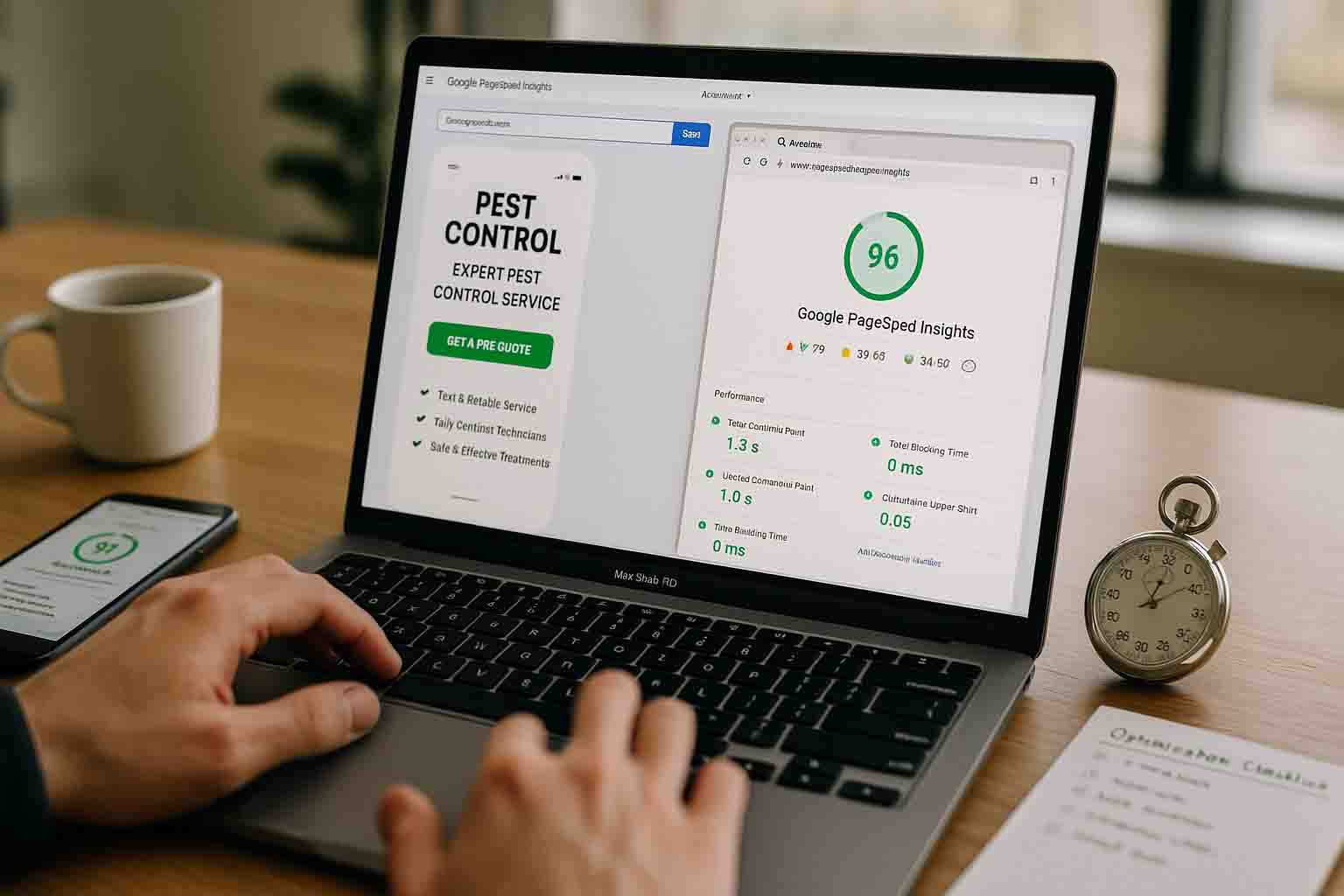
- Test your speed: Go to PageSpeed Insights (free Google tool) and test your homepage and key service pages
- Compress images: Use TinyPNG or similar tools to reduce image file sizes by 70%+ without losing quality
- Remove unnecessary plugins: That social media feed widget you added 2 years ago? Delete it if it's not generating leads
- Upgrade hosting: Move from $5/month shared hosting to managed hosting ($20-50/month)
- Enable caching: Use caching plugins or server-level caching to serve pages faster
Target: Get your load time under 3 seconds on mobile. Under 2 seconds is even better.
Mistake #2: Hidden or Hard-to-Find Phone Number
The Problem:
Your phone number is in the footer. Or it's in your logo (but too small to read). Or it only appears on your contact page. Or it's not clickable on mobile.
Why This Costs You Leads:
When someone has a pest problem, they want to call NOW. They're not interested in browsing your site. They're not filling out forms to "maybe hear back in 24 hours." They want to talk to a human who can schedule service today.
If they can't find your phone number immediately—or if they have to zoom in and manually type it on their phone—they're calling your competitor instead.
Real Example:
We audited a pest control company getting 400+ monthly visitors but only 8 phone calls. Their phone number was in the header... but it was the same color as the background (gray on gray). Visitors literally couldn't see it.
We made it prominent, added a click-to-call button, and put a floating phone button on mobile. Calls jumped to 42 the next month. Same traffic. Same company. Just a visible phone number.
How to Fix It:
- Put your phone number in the top-right header on every page (large enough to read easily)
- Make it clickable on mobile: Use
tel:links so tapping the number opens the phone dialer - Use contrasting colors: Your phone number should stand out, not blend in
- Add a floating call button on mobile: Sticky button that follows as users scroll ("Call Now" with your number)
- Include it in the hero section: Put it in your main headline area above the fold
Before you do anything else, fix this. This is the #1 easiest fix with the biggest impact.
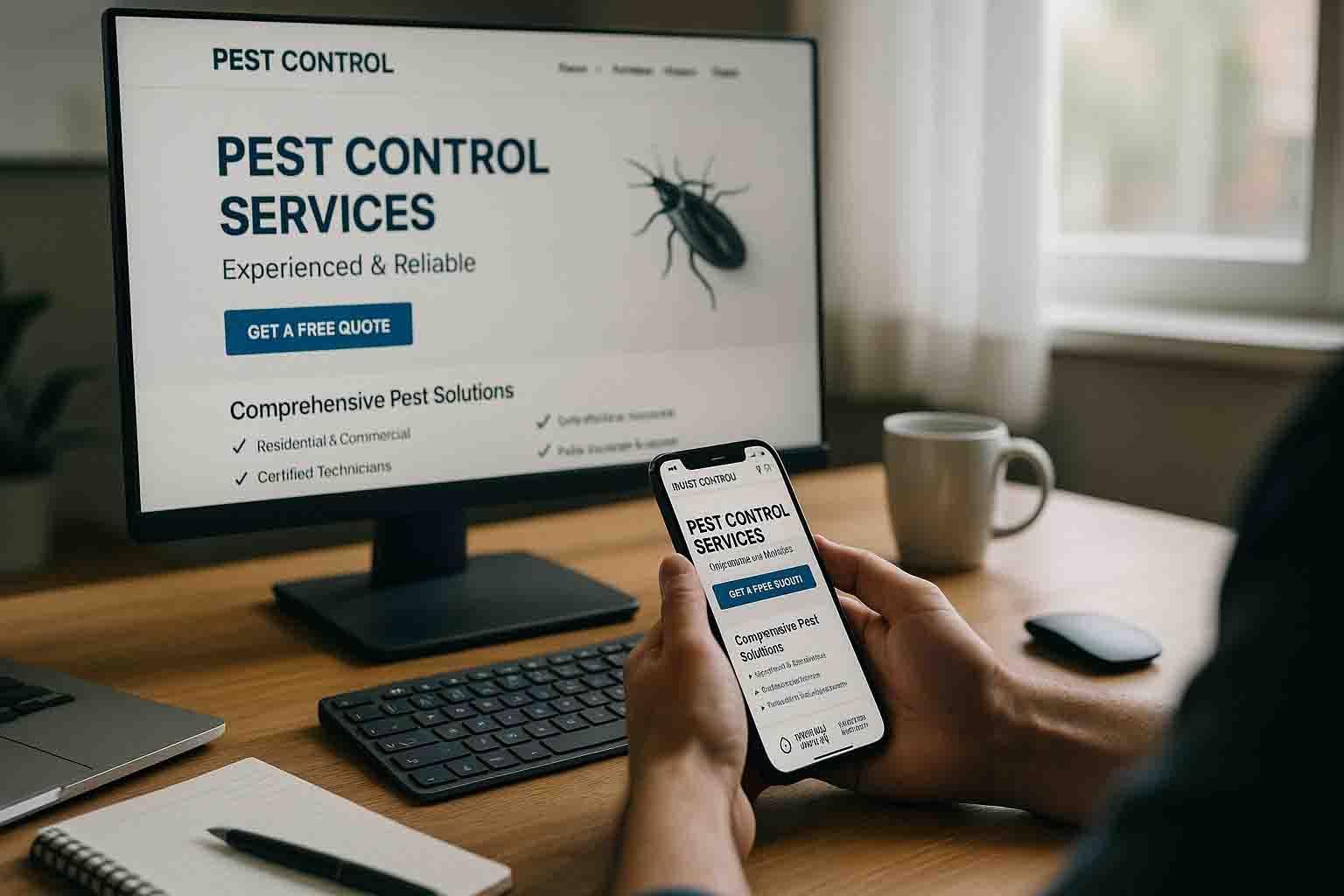
Mistake #3: Generic Stock Photos Instead of Real Business Photos
The Problem:
Your website uses stock photos of models in lab coats holding clipboards. Or generic images of pests from Shutterstock. Or absolutely no photos at all.
Why This Costs You Leads:
Pest control is personal. You're asking people to let strangers into their homes. They need to trust you.
Stock photos scream "generic website template" and make you look like every other pest control company. Worse, they can make you look fake or like you're hiding something.
Real photos build trust. When people see your actual team, your actual trucks, and your actual owner, they feel more comfortable calling.
What You Should Be Using Instead:
- Owner/team photos: Show the faces of people who'll be coming to their home
- Branded truck photos: Proves you're a real local business (not a national call center)
- On-the-job photos: Technicians performing inspections, treatments, etc.
- Before/after photos: Damage from pests, successful treatments (if applicable and not too gross)
- Office/warehouse photos: Shows you have a real local operation
How to Fix It:
You don't need a professional photographer (though it helps). Even smartphone photos are better than stock images—as long as they're well-lit and clear.
- Take photos of your team: Headshots and action shots
- Photograph your trucks: Show your branding
- Capture real jobs: (Get customer permission first)
- Replace ALL stock photos: Go through every page and swap them out
Pro Tip: Photos of real people get more engagement than photos of pests. Lead with your team, not with close-ups of cockroaches.
Mistake #4: No Clear Call-to-Action Above the Fold
The Problem:
Visitors land on your homepage and see:
- A slideshow of different pests
- Your company's mission statement
- A paragraph about "commitment to excellence"
- ...but no obvious button to request service or call
Your "Contact Us" link is buried in the menu. Your phone number is tiny. There's no clear next step for someone who wants to hire you RIGHT NOW.
Why This Costs You Leads:
You have 3 seconds to tell visitors what to do next. If the action isn't obvious, they won't take it.
People don't want to work hard to give you their business. Make it ridiculously easy to contact you, or they'll go somewhere else.
What "Above the Fold" Means:
Everything visible on the screen without scrolling. This is prime real estate. Don't waste it.
What Should Be Above the Fold:
✅ Clear headline (what you do + where you serve)
✅ Visible phone number
✅ Prominent CTA button ("Call Now" or "Get Free Quote")
✅ One trust signal (review stars, years in business)
How to Fix It:
- Add a large CTA button in your hero section ("Schedule Your Free Inspection" or "Call Now: [Number]")
- Use contrasting colors: Your CTA button should be impossible to miss
- Make it action-oriented: "Get Free Quote" is better than "Learn More"
- Repeat CTAs throughout the page: Don't rely on just one button
Test this: Load your homepage on your phone. Without scrolling, is it 100% obvious how to contact you? If not, fix it.
Mistake #5: Not Mobile-Optimized (Beyond Just "Responsive")
The Problem:
Your site technically "works" on mobile—the layout adjusts to smaller screens. But the experience is frustrating:
- Buttons are too small to tap accurately
- Forms have 12 fields and tiny input boxes
- Phone number isn't clickable
- Images take forever to load
- Text is too small to read without zooming
Why This Costs You Leads:
60-70% of your website traffic comes from mobile devices. If the mobile experience is bad, you're losing the majority of your potential customers.
And remember: people searching for pest control on mobile are often dealing with an active problem. They're not casually browsing. They need help NOW. A clunky mobile experience means they call someone else.
How to Fix It:
- Make phone numbers tap-to-call (use
tel:links) - Simplify mobile forms: Name, phone, pest type. That's it. Get details on the call.
- Use large, tappable buttons: Minimum 44px height (Apple's recommendation)
- Remove hover-dependent features: Dropdown menus that require hover don't work on touch screens
- Compress images aggressively for mobile: Serve smaller image sizes to mobile devices
- Test on a real phone: Not just Chrome's mobile simulator—an actual phone on cellular data
Quick Mobile Test:
- Can you easily tap the phone number? ✓
- Can you submit a form without zooming in? ✓
- Can you navigate to service pages without frustration? ✓
- Does the page load in under 3 seconds? ✓
If any answer is "no," you're losing mobile leads.
Mistake #6: Missing or Weak Trust Signals
The Problem:
Your website doesn't show:
- Customer reviews
- Years in business
- Certifications or licenses
- Photos of your team
- Guarantees
Essentially, you're asking strangers to let you into their homes without proving you're legitimate, experienced, and trustworthy.
Why This Costs You Leads:
Pest control is an extremely high-trust industry. You're dealing with people's homes, their families, their pets. They need reassurance that you're not going to:
- Scam them
- Do a bad job
- Use unsafe chemicals
- Disappear after taking payment
Without trust signals, even people who WANT to hire you might hesitate and shop around more—giving competitors a chance to win them over.
What Trust Signals Should You Display:
1. Reviews and Ratings
- Google review widget showing star rating and review count
- Testimonials with customer names (first name + last initial)
- Specific reviews mentioning results ("Got rid of our ant problem in 2 days")
2. Credentials
- State pest control license
- Certifications (QualityPro, Associate Certified Entomologist, etc.)
- "Licensed and Insured" badge
- Better Business Bureau rating
3. Experience
- Years in business ("Serving [City] Since 2008")
- Number of customers served
- Family-owned language (if applicable)
4. Guarantees
- Service guarantee ("If pests return within 30 days, we'll retreat free")
- Money-back guarantee (if you offer one)
- Satisfaction guarantee
5. Real Photos
- Owner photo with brief bio
- Team photos (shows you're real people)
- Truck photos with your branding
Where to Place Them:
- Homepage (multiple trust signals above and below the fold)
- Service pages (near CTAs)
- About page (concentrated proof of legitimacy)
- Footer (certifications, licenses)
How to Fix It:
- Add Google review widget to homepage (shows real-time rating)
- Create testimonials section with customer quotes
- Display credentials prominently (header or footer)
- Add owner bio and photo to About page
- Include guarantees near CTAs
People won't hire you if they don't trust you. Make trust-building a priority.
Mistake #7: Vague Service Area Information
The Problem:
Your website says you serve "the greater [city] area" but doesn't specify which cities, towns, or neighborhoods. Or worse—there's NO service area information at all.
Someone in a suburb 30 minutes away visits your site, can't tell if you serve their area, and moves on.
Why This Costs You Leads:
People won't call if they're not sure you serve their location. They assume you don't and look for a company that explicitly serves their town.
You're also missing out on local SEO opportunities. Google wants to show people businesses that serve their specific location. If your website doesn't clearly define your service area, Google might not rank you for searches in those areas.
How to Fix It:
- Create a dedicated Service Areas page listing every city/town you serve
- Add service area to homepage: "Proudly Serving [City], [Suburb 1], [Suburb 2], and Surrounding Areas"
- Include service area on every service page: Reinforce where you offer each service
- Add a map: Visual representation of your territory
- Create location-specific pages (if you have budget): Individual pages for major cities/suburbs you serve
Example Service Area Section:
Service Areas:
- Downtown [City]
- [Suburb 1]
- [Suburb 2]
- [Suburb 3]
- [Nearby Town 1]
- [Nearby Town 2]
+ 15 more cities in [County] County
Bonus: Include response time by area if it varies: "Same-day service available in [City], 24-hour service in surrounding areas."
Make it crystal clear where you operate. Don't make people guess.
The Cost of These Mistakes (Real Numbers)
Let's do the math on what these mistakes are actually costing you.
Scenario:
- Your website gets 300 visitors per month
- Industry average conversion rate: 3-5% (9-15 leads per month)
- Your current conversion rate with these mistakes: 1.5% (4-5 leads per month)
You're losing: 4-10 leads per month
If your average job value is $400: That's $1,600-$4,000 per month in lost revenue. $19,200-$48,000 per year.
And that's just direct lost revenue. It doesn't account for:
- Lost recurring customers
- Lost referrals
- Lost reviews (fewer customers = fewer reviews = worse rankings)
- Competitive advantage given to competitors who ARE getting those leads
Fixing these 7 mistakes could literally double your website conversion rate. Same traffic. Double the leads.
Start With the Quick Wins
You don't have to fix everything at once. Prioritize based on impact:
Fix This Week:
- Make phone number prominent and clickable (Mistake #2)
- Add clear CTA button above the fold (Mistake #4)
- Add Google review widget to homepage (Mistake #6)
Fix This Month:4. Optimize page speed (Mistake #1)5. Replace stock photos with real team/truck photos (Mistake #3)6. Add detailed service area information (Mistake #7)
Fix This Quarter:7. Audit and improve mobile experience (Mistake #5)
Start with the phone number and CTA. Those two changes alone could increase your leads by 20-30% this month.
Need Help Fixing Your Pest Control Website?
We've spent 13+ years building and optimizing pest control websites. We know exactly what converts visitors into customers because we track it every month for our clients.
Our web design service includes:
- Complete audit of conversion-killing mistakes
- Mobile-optimized design that actually works on phones
- Strategic placement of trust signals and CTAs
- Ongoing monthly optimization based on real performance data
We only work with one pest control company per metropolitan area, so spots are limited.
Schedule a 15-minute discovery call to see if we can help you stop losing leads.