Your website got 312 visitors last month. Seven people called. Four filled out your contact form.
That's a 3.5% conversion rate.
Now imagine if you could double that. Same traffic. Same ad spend. But 22 calls instead of 11.
That's an extra 11 jobs per month. At an average job value of $400, that's $4,400 in additional monthly revenue—$52,800 per year—without spending a penny more on marketing.
This is conversion rate optimization (CRO). And it's the most overlooked opportunity in pest control marketing.
Most pest control companies obsess over getting MORE traffic. More SEO rankings. More ad clicks. More social media followers.
But they ignore the fact that 95%+ of their current website visitors leave without taking action.
You don't necessarily need more traffic. You need to convert the traffic you already have.
This guide shows you exactly how to optimize your pest control website for conversions—turning more visitors into calls, quotes, and booked jobs.
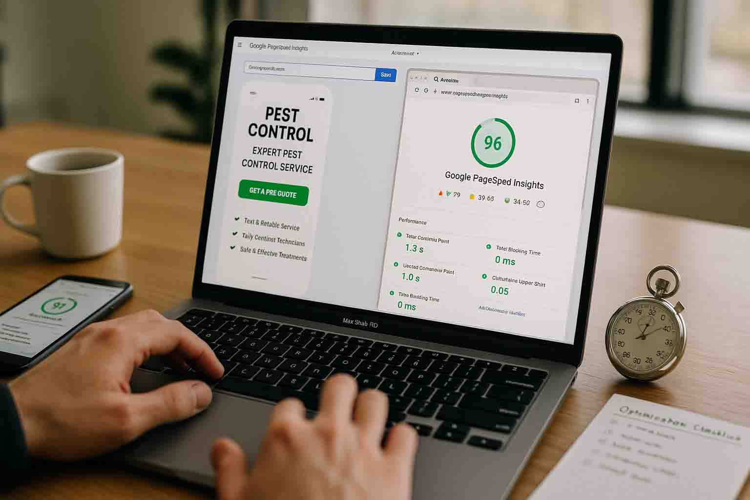
What Is Conversion Rate Optimization (And Why Should You Care)?
Conversion rate optimization (CRO) is the process of increasing the percentage of website visitors who take a desired action.
For pest control companies, that desired action is usually:
- Calling your business
- Filling out a contact/quote form
- Using a chat widget to reach out
- Clicking a "Schedule Now" button
Your conversion rate = (Conversions ÷ Total Visitors) × 100
Example:
- 300 monthly visitors
- 9 phone calls + 3 form fills = 12 total conversions
- Conversion rate = (12 ÷ 300) × 100 = 4%
Why CRO Matters More Than You Think
Scenario 1: Focus on Traffic Only
- Increase traffic by 50% (150 visitors → 225 visitors)
- Same 4% conversion rate
- Result: 6 conversions → 9 conversions (+3 leads)
- Cost: Significantly higher ad spend or months of SEO work
Scenario 2: Focus on CRO
- Keep same traffic (150 visitors)
- Improve conversion rate from 4% to 7%
- Result: 6 conversions → 10.5 conversions (+4.5 leads)
- Cost: Minimal (mostly time to optimize your site)
CRO gives you better ROI with less investment. Every percentage point of improvement means more leads without increasing your marketing budget.
What's a "Good" Conversion Rate for Pest Control Websites?
This is the most common question we get, and the answer is: it depends.
Industry Benchmarks:
- Below 2% - Your website has serious conversion problems
- 2-4% - Average for pest control companies
- 4-7% - Above average, good performance
- 7-10% - Excellent, well-optimized site
- 10%+ - Outstanding (rare, but achievable)
Factors that affect your conversion rate:
- Traffic source (Google Ads converts better than organic search, which converts better than social media)
- Service type (emergency services like bed bugs convert higher than preventive services)
- Geographic market (competitive markets may see lower rates)
- Season (peak pest season converts better)
- Mobile vs. desktop traffic (mobile typically converts lower IF not properly optimized)
Don't obsess over hitting a specific number. Instead, focus on improving YOUR conversion rate over time. If you're at 3% today, aim for 4% next quarter. Then 5%. Then 6%.
Small improvements compound into significant revenue increases.
The 3-Second Rule: What Visitors Need to See Immediately
You have 3 seconds to convince someone they're in the right place and should stay on your site.
Within 3 seconds, visitors should know:
- What you do
- Where you serve
- How to contact you
If any of these three things is unclear, you're losing conversions.
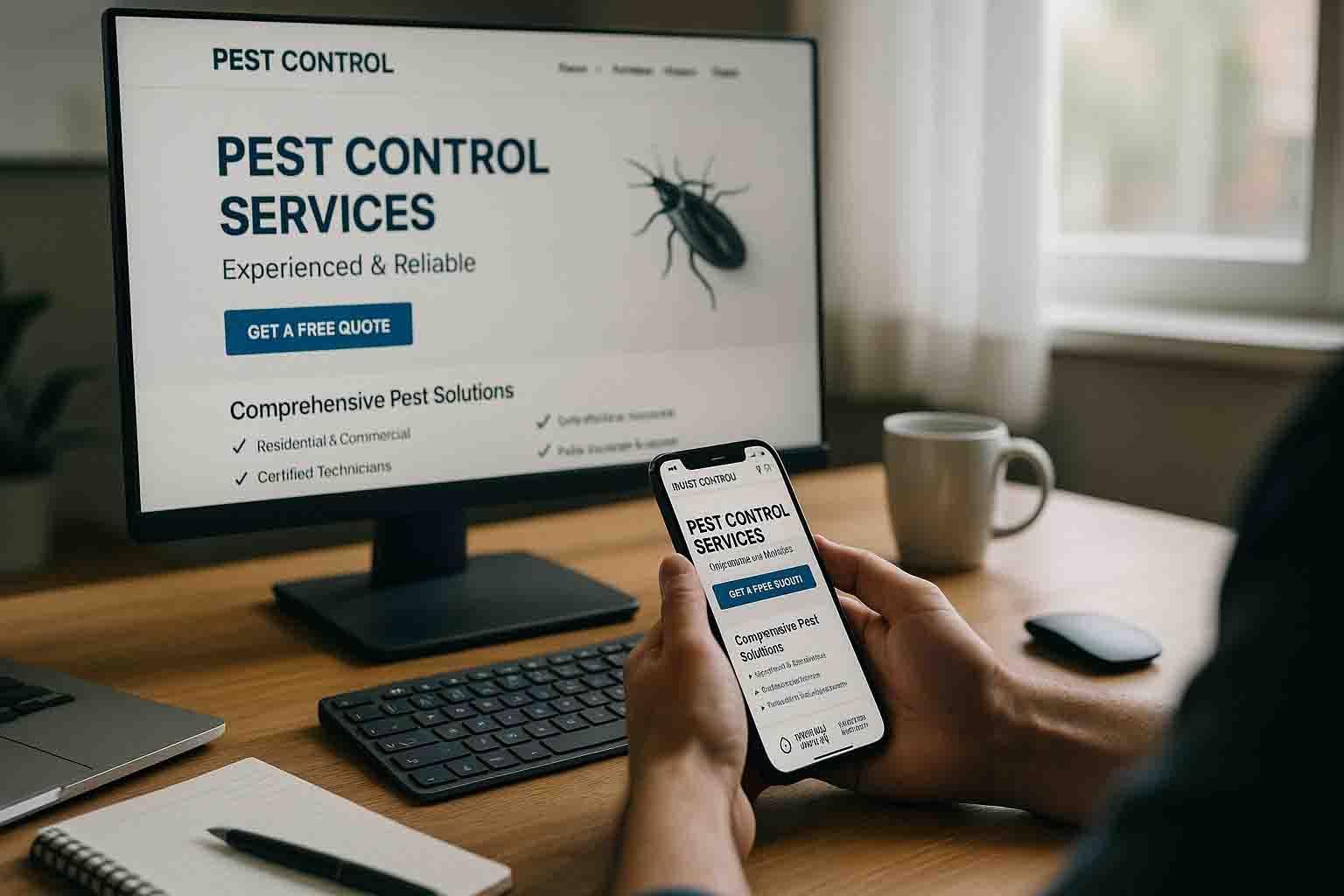
The Above-the-Fold Checklist
✅ Clear, Specific Headline
- Bad: "Your Trusted Pest Solution Partner"
- Good: "Professional Pest Control in [City] - Same-Day Service Available"
✅ Visible Phone Number
- Large enough to read without zooming
- Contrasting color (stands out from background)
- Clickable on mobile (tap-to-call)
✅ Prominent CTA Button
- High-contrast color (red, orange, green against neutral background)
- Action-oriented text ("Call Now," "Get Free Quote," "Schedule Service")
- Large enough to see and click easily (minimum 44px height on mobile)
✅ One Trust Signal
- Google review stars: "★★★★★ 4.8/5 (156 Reviews)"
- Years in business: "Serving [City] Since 2007"
- Certification badge: "Licensed & Insured"
✅ Service Area Clarity
- "Serving [City], [Suburb 1], [Suburb 2] & Surrounding Areas"
- Don't make people hunt for this information
The 3-Second Test
Pull up your homepage on your phone right now. Before scrolling, can you answer:
- What does this company do?
- Do they serve my area?
- How do I contact them?
If you can't answer all three immediately, your above-the-fold section is costing you conversions.
Strategic CTA Placement: Multiple Touchpoints Throughout the Page
One "Contact Us" button at the bottom isn't enough. People make decisions at different points while reading your page.
Where to Place CTAs:
1. Header/Navigation (Persistent)
- "Call Now" button in top-right corner
- Phone number always visible
- Stays on screen as users navigate
2. Hero Section (Primary CTA)
- Large button below your headline
- Most prominent CTA on the page
- First opportunity to convert
3. After Services Overview
- "See a Pest? We Can Help - Call [Number]"
- Natural break after introducing services
4. After Social Proof Section
- After showing reviews/testimonials
- Capitalize on trust momentum
- "Ready to experience this level of service? Call now"
5. After Problem/Solution Sections
- Once you've educated them
- They're ready to take action
6. Bottom of Page (Final CTA)
- Last chance before they leave
- Often the most effective placement for thorough readers
7. Floating/Sticky Element (Mobile)
- Call button that follows as they scroll
- Always accessible
- Particularly effective on mobile
Rule of thumb: Visitors should encounter a CTA every 1-2 screen scrolls. If they have to scroll for 5+ seconds to find your next call-to-action, you're missing opportunities.
CTA Button Optimization: Small Changes, Big Impact
Your CTA button is the gateway to conversion. Small optimizations here have outsized impact.
Button Text That Converts
Use Action Verbs + Clear Outcome:
✅ "Call Now: (555) 123-4567"
✅ "Get Your Free Inspection"
✅ "Schedule Service Today"
✅ "Request a Quote"
✅ "Book Your Appointment"
❌ "Learn More" (vague, low commitment)
❌ "Click Here" (tells them nothing)
❌ "Submit" (sounds like work)
❌ "Contact" (unclear what happens next)
Pro Tip: Including the phone number IN the button ("Call Now: 555-123-4567") can increase clicks by 20-30% because it's immediately clear what will happen.
Button Color Psychology
High-Conversion Colors:
- Orange - Creates urgency, stands out
- Green - Associated with "go," positive action
- Red - Creates urgency, grabs attention
- Blue - Trustworthy, professional (but may blend in)
The most important factor: Contrast with your background. A red button on a red background won't work. An orange button on a blue background will pop.
Test different colors. What works for one site may not work for yours. A/B test to find your winner.
Button Size and Placement
Desktop:
- Minimum width: 200px
- Minimum height: 50px
- Don't crowd with other elements
Mobile:
- Minimum width: 280px (nearly full-width on phone)
- Minimum height: 44px (Apple's recommended tappable size)
- Extra padding around button (easier to tap)
Placement:
- Center-aligned buttons perform better than left-aligned
- Buttons that "float" above the background (shadow effect) get more clicks
- White space around buttons increases click-through rate
Trust Signals That Actually Convert
Trust is the #1 barrier to conversion in pest control. You're asking strangers to let you into their homes. They need proof you're legitimate.
The Most Effective Trust Signals (In Order of Impact)
1. Google Reviews (Highest Impact)
- Display your star rating prominently: "★★★★★ 4.9/5"
- Show review COUNT: "(247 Reviews)" - volume matters
- Embed Google review widget on homepage
- Link to your Google Business Profile
Why it works: Third-party validation from real customers. Can't be faked.
2. Specific Customer Testimonials
- Use real names: "John M., [Neighborhood]" not just initials
- Include the pest type: "Their bed bug treatment saved us"
- Show the result: "Haven't seen a single ant in 6 months"
- Add photos if possible (with customer permission)
Why it works: Specificity = credibility. Vague testimonials sound fake.
3. Certifications and Licenses
- State pest control license number
- Industry certifications (QualityPro, Associate Certified Entomologist)
- "Licensed, Bonded & Insured" badge
- EPA certifications
Why it works: Proves you're a legitimate, regulated business.
4. Years in Business
- "Serving [City] Since 2005"
- "20+ Years of Experience"
- "Family-Owned for Three Generations"
Why it works: Longevity suggests reliability and quality.
5. Service Guarantees
- "If pests return within 30 days, we'll retreat for free"
- "100% Satisfaction Guaranteed"
- "Money-Back Guarantee"
Why it works: Reduces perceived risk of making a bad decision.
6. Real Photos (Team, Trucks, Office)
- Owner photo with brief bio
- Technician photos in uniform
- Branded trucks at job sites
- NOT stock photos
Why it works: Humanizes your business, proves you're local and real.
Where to Place Trust Signals
Homepage:
- Review rating in hero section (above the fold)
- "Licensed & Insured" badge in header
- Testimonials mid-page
- Certifications in footer
Service Pages:
- Review rating near CTA buttons
- Service-specific testimonials
- Guarantee near bottom CTA
About Page:
- Team photos
- Certifications
- Company history
- Community involvement
Pro Tip: Put trust signals NEAR your CTAs. When someone is about to take action, that's when they need reassurance most.
Form Optimization: Finding the Right Balance
Contact forms are tricky. Too few fields and you don't get enough information. Too many fields and people abandon the form.
The Optimal Form Length
For Pest Control Companies:
3-5 fields is the sweet spot:
- Name (First + Last or just First)
- Phone Number (required)
- Email (optional or required)
- Service Needed (dropdown: Ants, Bed Bugs, Termites, etc.)
- Brief Message (optional)
Do NOT ask for:
- Address at this stage (get it on the phone call)
- Detailed property information
- How they heard about you (track this another way)
- Multiple contact preferences
- Account creation
Why shorter works better: Every additional field decreases conversion rate by 5-10%. People don't want to fill out a job application—they want to request service.
Form Design Best Practices
✅ Do This:
- Large input fields (easy to tap on mobile)
- Clear labels inside or above fields
- Auto-focus on first field when page loads
- Mobile keyboard optimization (number pad for phone field)
- Error messages that are helpful ("Please enter a valid phone number")
- Success message after submission ("Thanks! We'll call you within 2 hours")
❌ Don't Do This:
- CAPTCHA (unless you have a spam problem)
- Multiple required fields marked with asterisks (overwhelming)
- Placeholder text that disappears when typing (confusing)
- Dropdown menus with 30+ options
- Multi-page forms
Form Placement
Best Locations:
- Hero section (right side on desktop, below headline on mobile)
- After social proof section (they're convinced, ready to act)
- Bottom of page (final opportunity)
Consider: Having the same form appear in multiple locations on long pages. Each appearance is a conversion opportunity.
Click-to-Call Optimization (Especially on Mobile)
60-70% of your traffic comes from mobile devices. On mobile, people want to CALL, not fill out forms.
Mobile-Specific Tactics
1. Tap-to-Call Phone Numbers
- Every phone number should use
<a href="tel:+15551234567">format - Tapping the number opens phone dialer immediately
- No copying/pasting required
2. Sticky Call Button
- Floating button that stays visible while scrolling
- Large, impossible to miss
- "Call Now" or "📞 Call [Number]"
- Positioned at bottom of screen (easy thumb access)
3. Prominent Header Phone Number
- Display number in header on every page
- Make it large (16-18px font minimum)
- High contrast color
- Always clickable
4. Call-First Design
- Put phone CTAs before form CTAs on mobile
- Recognize that mobile users prefer calling
- "Call Now" button more prominent than "Request Quote"
Desktop Call Optimization
Even on desktop, make calling easy:
- Large, visible phone number in header
- Click-to-call if they're on a laptop with phone capabilities
- Multiple phone number placements throughout page
- Consider click-to-call popup/modal
Tracking tip: Use call tracking numbers to measure which pages/campaigns generate calls. Services like CallRail or CallTrackingMetrics can help.
Using Urgency Without Being Pushy
Urgency drives action. Without it, people procrastinate. But there's a right way and wrong way to create urgency.
✅ Legitimate Urgency Tactics
1. Availability-Based
- "Same-day service available (limited spots)"
- "We're booking 2-3 days out due to high demand"
- "Next available appointment: [Date]"
2. Problem-Based
- "Pest problems get worse every day you wait"
- "Termites cause $5 billion in damage annually in the US"
- "Bed bug infestations double in size every 16 days"
3. Seasonal
- "Mosquito season peaks in June - schedule now"
- "Rodents seek shelter as temperatures drop"
- "Termite swarm season is here"
4. Promotional (If Running Specials)
- "$50 off first treatment - expires [Date]"
- "Spring special ends April 30th"
- "Limited to first 20 customers"
❌ Fake Urgency to Avoid
- Countdown timers that reset when you refresh the page
- "Only 2 spots left!" that never changes
- Fake scarcity ("almost sold out" for a service)
- Aggressive popups ("Wait! Don't leave!")
Be honest. If you truly have limited availability, say so. If it's peak season, mention it. But don't manufacture fake urgency—it damages trust.
Heat Mapping and User Behavior Tracking
Want to know what's actually happening on your website? Stop guessing and start tracking.
Tools to Use
1. Hotjar (Free tier available)
- Heat maps showing where people click
- Scroll maps showing how far people read
- Session recordings (watch real visitors use your site)
- Feedback polls
2. Microsoft Clarity (Completely free)
- Heat maps and click tracking
- Session recordings
- Rage click detection (where people click repeatedly in frustration)
- Dead click detection (clicking non-clickable elements)
3. Google Analytics (Free)
- Bounce rate by page
- Average time on page
- Exit pages (where people leave your site)
- Traffic sources and conversion rates by source
What to Look For
Red Flags:
- High bounce rate on key pages (70%+)
- Very short time on page (under 10 seconds)
- Rage clicks (people clicking frantically, indicating frustration)
- Form abandonment (starting but not completing forms)
- Dead clicks (clicking on non-clickable elements, thinking they're buttons)
Insights:
- Where do people click? (Are they clicking non-clickable things? Make those things clickable!)
- How far do people scroll? (If 80% never scroll past the fold, move important info up)
- Where do forms get abandoned? (Which field causes people to give up?)
- What pages have the highest exit rate? (Those pages need optimization)
Action items based on data:
- If people are clicking on non-clickable text, make it a button or link
- If people aren't scrolling far, put key info and CTAs higher
- If a specific form field has high abandonment, consider removing it
- If certain pages have high exit rates, add CTAs or improve content
A/B Testing: The Scientific Approach to Conversion Optimization
Stop guessing what will work. Start testing.
What to A/B Test (In Order of Impact)
1. Headlines
- Test problem-focused vs. benefit-focused
- Test specific vs. general
- Example: "Pest Control in Austin" vs. "Get Rid of Pests in 24 Hours"
2. CTA Button Text
- Test "Call Now" vs. "Get Free Quote" vs. "Schedule Service"
- Test adding phone number to button vs. without
3. CTA Button Color
- Test red vs. orange vs. green
- Ensure high contrast with background
4. Hero Image
- Test team photo vs. truck photo vs. pest photo
- Test with human faces vs. without
5. Form Length
- Test 3 fields vs. 5 fields
- Test required vs. optional fields
6. Social Proof Placement
- Test reviews above the fold vs. mid-page
- Test number of testimonials (3 vs. 6)
7. Trust Signal Emphasis
- Test prominent "Licensed & Insured" badge vs. subtle mention
- Test certifications in header vs. footer
How to A/B Test Properly
Rules for valid testing:
- Change ONE thing at a time
- If you test headline + button color simultaneously, you won't know which drove results
- Run tests long enough
- Minimum: 100-200 conversions OR 2-4 weeks
- Don't stop a test after 2 days because one version is "winning"
- Account for statistical significance
- Use A/B testing calculators to ensure results are meaningful
- A 2% difference with 50 visitors isn't significant
- A 20% difference with 1,000 visitors is
- Test during similar time periods
- Don't compare July (peak season) to December (slow season)
- Run both versions simultaneously, not sequentially
Tools for A/B Testing:
- Google Optimize (free, integrates with Google Analytics)
- Unbounce (paid, for landing pages)
- VWO (paid, comprehensive testing platform)
- Optimizely (paid, enterprise-level)
Real A/B Testing Example
Test: CTA Button Text
- Version A: "Learn More"
- Version B: "Get Free Inspection"
Results (after 1,000 visitors each):
- Version A: 23 clicks (2.3% CTR)
- Version B: 47 clicks (4.7% CTR)
Winner: Version B (104% improvement)
Why it won: Specific, benefit-oriented language vs. vague "Learn More"
Small changes like this can literally double your conversion rate.
Quick Wins: 5 Changes You Can Make This Week
Don't wait to implement everything. Start with these high-impact, low-effort changes:
1. Make Your Phone Number Prominent and Clickable (30 minutes)
- Move it to top-right header
- Increase font size
- Make it click-to-call on mobile
- Use contrasting color
Expected impact: 15-25% increase in calls
2. Add a Google Review Widget to Homepage (20 minutes)
- Embed your Google reviews using free tools
- Place above the fold or in social proof section
- Shows real-time ratings
Expected impact: 10-20% increase in form submissions
3. Simplify Your Contact Form (15 minutes)
- Remove any non-essential fields
- Keep only: Name, Phone, Email, Service Type
- Make sure it works perfectly on mobile
Expected impact: 20-30% increase in form completions
4. Add a Floating Call Button on Mobile (1 hour)
- Sticky button at bottom of screen
- "📞 Call Now" text
- Links to your phone number
- Follows as users scroll
Expected impact: 10-15% increase in mobile calls
5. Improve Your Hero Section Headline (30 minutes)
- Make it specific (not generic)
- Include location
- Focus on benefit or problem
- Example: "Same-Day Pest Control in [City]" instead of "Professional Pest Solutions"
Expected impact: 5-15% decrease in bounce rate
Total time investment: About 3 hours
Total potential impact: 20-40% increase in conversions
The Compound Effect of Small Improvements
Here's the math that should get you excited:
Starting point:
- 300 monthly visitors
- 3% conversion rate
- 9 monthly leads
- $400 average job value
- $3,600 monthly revenue from website
After optimizations:
- Same 300 monthly visitors
- 6% conversion rate (doubling conversion rate through CRO)
- 18 monthly leads
- $400 average job value
- $7,200 monthly revenue from website
Result: $3,600 additional monthly revenue = $43,200 additional annual revenue
And this compounds with traffic growth. If you later increase traffic to 500 visitors/month:
- At old 3% conversion rate = 15 leads = $6,000/month
- At new 6% conversion rate = 30 leads = $12,000/month
CRO multiplies the value of every marketing dollar you spend.
The Bottom Line: Convert Before You Scale
Most pest control companies make this mistake: They focus on getting more traffic before optimizing the traffic they have.
The smarter approach:
- First: Optimize your website for conversions (CRO)
- Then: Invest in traffic (SEO, ads, etc.)
Why? Because every improvement you make to conversion rate multiplies the effectiveness of your future marketing spend.
If you're converting at 3% and you double your traffic, you double your leads.
If you're converting at 6% and you double your traffic, you QUADRUPLE your original lead volume.
Start with these fundamentals:
- Clear above-the-fold messaging (3-second rule)
- Multiple strategic CTAs throughout pages
- Prominent, clickable phone numbers (especially mobile)
- Strong trust signals near conversion points
- Simplified contact forms
- Legitimate urgency
- Regular A/B testing
Every 1% improvement in conversion rate is money in your pocket—without spending more on marketing.
Need Help Optimizing Your Website for Conversions?
We've spent 13+ years optimizing pest control websites, and we track conversion rates obsessively. We know what works because we test everything and measure results monthly.
Our approach includes:
- Complete conversion rate audit
- Strategic CTA placement and optimization
- Trust signal implementation
- Mobile conversion optimization
- Ongoing A/B testing to continuously improve performance
- Monthly reporting showing exactly how your conversion rate is improving
We only work with one pest control company per metropolitan area, so your optimizations benefit only you.
Schedule a 15-minute discovery call to discuss your conversion goals.